08 / 08Visual Directions
01 / Work
Overview
Visual Directions
Campaign, poster, and cover design explorations

Campaign visuals, posters, and publication covers
Enduring Blooms
Enduring Blooms
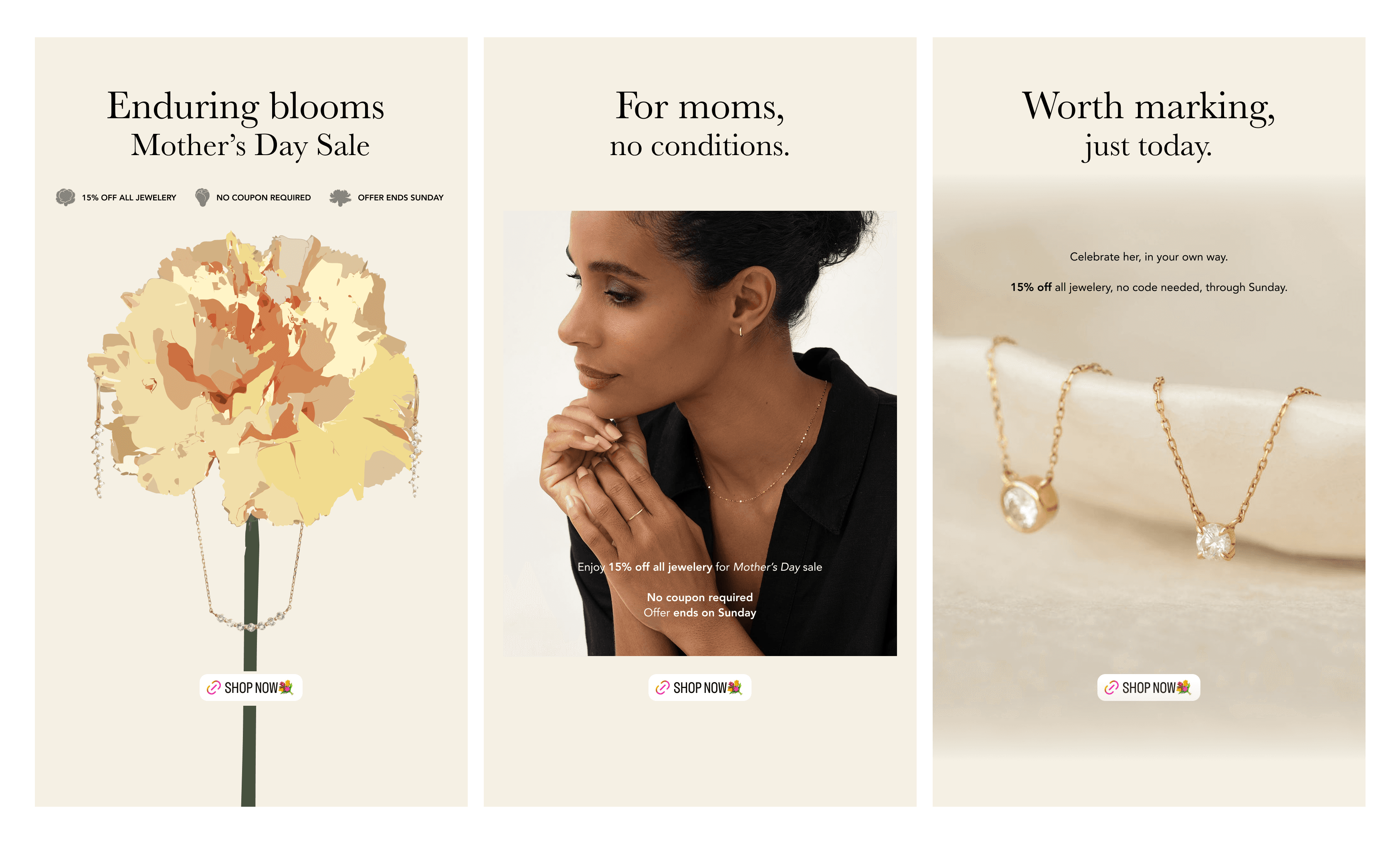
Mother’s Day IG Story Ad Concept
A three-part Mother’s Day IG Story series exploring jewellery gifting through seasonal symbolism, personal connection, and product detail.
The first visual transforms the carnation into a flattened graphic motif and display structure for the jewellery. The second introduces an intimate portrait to bring the message closer to the wearer, while the third uses softly lit product photography to emphasise material detail and the time-limited offer.
Warm neutral tones, restrained typography, and a consistent promotional hierarchy connect the three executions as one campaign system.
Mother & Motherland
Mother & Motherland
Mother’s Day Poster
Two poster directions explore the relationship between motherhood and motherland through geological form.
The first uses stone texture, shadow, and surface depth to reveal the impression of a mother and child within the rock. The second draws on layered sandstone and sweeping contours to express formation, continuity, and accumulated time.
A restrained bilingual typographic system unifies both compositions, allowing the natural structures to carry the emotional and symbolic weight of the theme.

Reading, Reflection & the Mind
Reading, Reflection & the Mind
Course Promotion Poster
A course promotion poster developed for an interdisciplinary programme exploring psychological disorders through classic texts, critical discussion, and humanistic perspectives.
A continuous scroll-like form connects reading with an unfolding process of interpretation. Questions drawn from the course themes are distributed around the composition, while the large title and supporting information establish a clear hierarchy across a content-heavy layout.
Two colour directions explore different tones within the same visual system. The ivory and ochre version creates a warmer, more literary atmosphere, while the muted green and stone-grey version presents a calmer and more grounded academic character. Grain texture gives both posters a tactile, print-like quality.

Cover Design
Cover Design
for thesis -
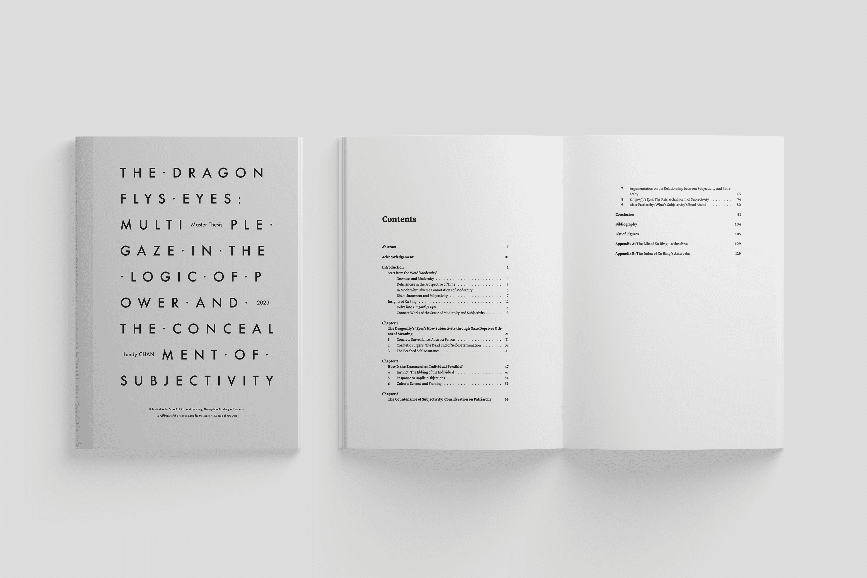
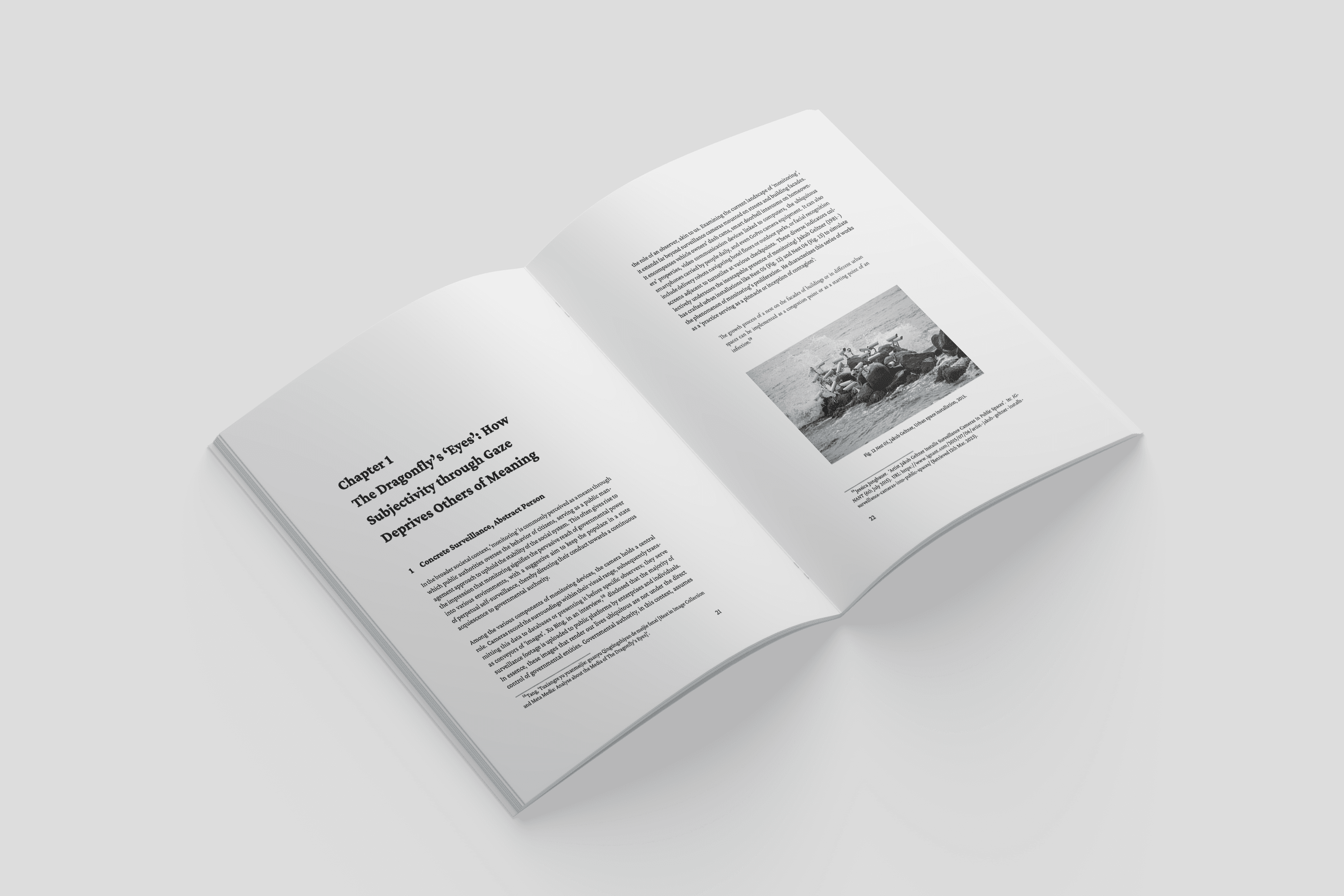
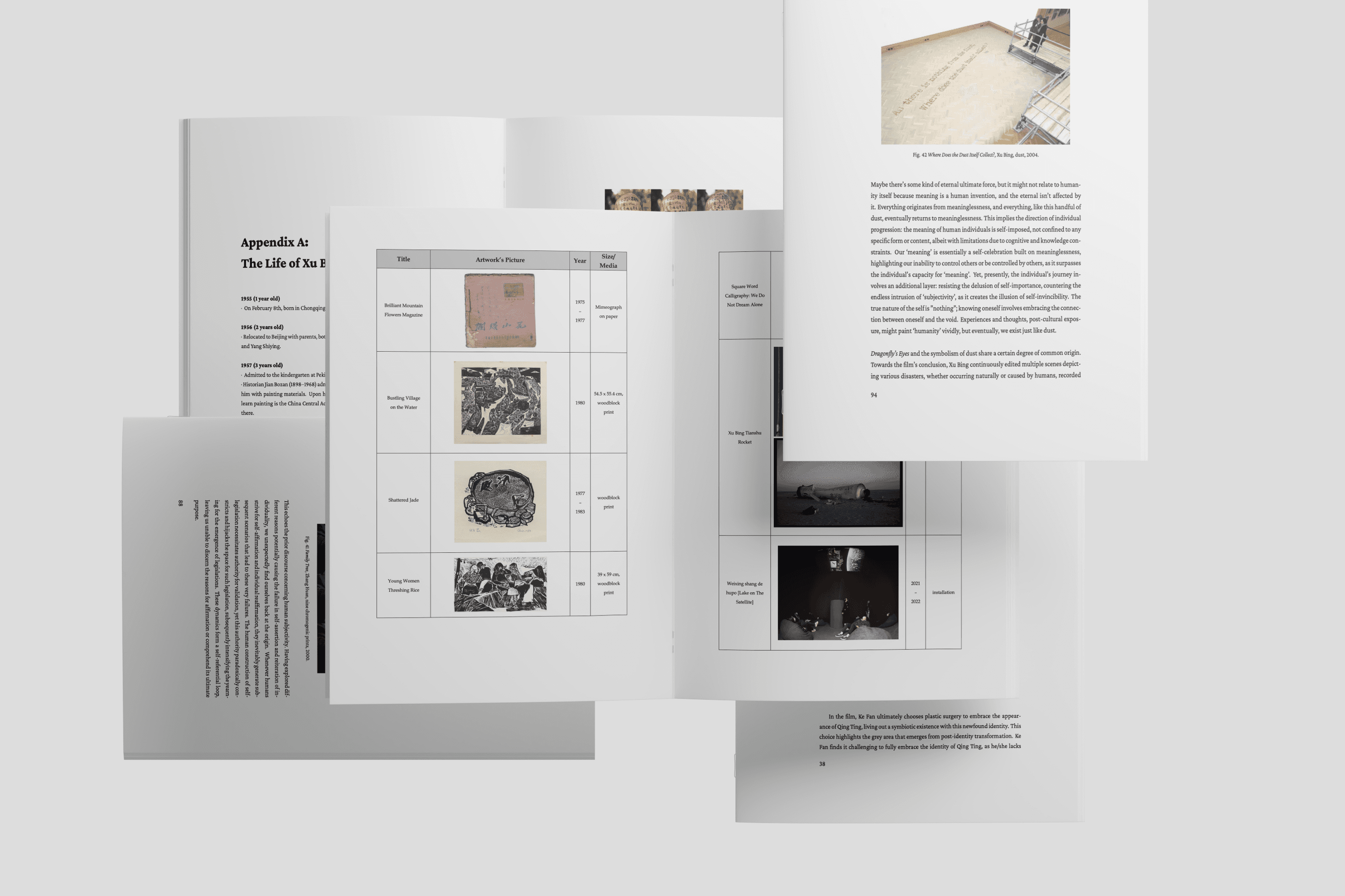
The Dragonfly's Eyes: Multiple Gaze in the Logic of Power and the Concealment of Subjectivity
This cover design uses enlarged letter spacing, fragmented line breaks, and inserted secondary information to turn the thesis title into a visual field.
The scattered dots and stretched typography create a sense of distance, interruption, and surveillance, echoing the thesis’s concern with gaze, power, and concealed subjectivity.
The grey tonal background keeps the cover restrained, while the typographic structure makes the title feel observed, dispersed, and difficult to grasp at once.
Read the full text here